Friday, May 2, 2014

Parallel Project

 
The concept for this project is to take a news story and use different metaphors to represent that story. I chose the story about Russia and the Ukraine and how Russia was using the Sochi Olympics to cover up the tension between the two counties. My idea to represent this story is to take the Olympic Rings and add one of the Winter Olympic sports in each ring and fireworks surrounding everything, then behind the sports and rings is a picture to represent the tension between Russia and the Ukraine. I've decided to do this project on Photoshop so I can lower the opacity of each layer and make it look like it's faded into the background which would be hard to do in a painting or drawing. 

Sunday, April 27, 2014

Final Time Post

Artists Develop Art Making Skills: I've never really liked doing painting, I always feel like I don't have as much control for details. That's why I usually do drawings over paintings. So I decided to try something different and attempt a painting for this project. With this project I felt like I improved my paint mixing skills and detail work with a paint brush. It was really hard to get the little lines, I felt like I couldn't find a brush small enough.
Artists Communicate Through Their Work: The main theme for this piece was to pretty much ruin your childhood and make you feel depressed for the rest of the day, and it accomplished what I wanted it to. When we did the Feel Good Friday for this project most of the comments were saying that this was something they had never thought about before or that I had ruined their childhood or that they were really sad now, but overall the piece was well done. Even I was sad as I worked on it, Peter Pan has always been one of my favorite Disney movies so taking such a dark twist on something I love was really hard for me to do. It made it easier for me to imagine how people felt as they looked at the final piece because it made me feel the same way.

Friday, April 25, 2014

Poster

For this project we each had to create a poster for The Art of Apex High exhibit at the Halle Cultural Arts Center. First I chose a gradient background and then I put the diamond gradient over top. Next I found three different fonts to use for the text and decided where each part should go. Then I added some of the pictures that are going to be in the show and added a background to each one. I felt like it was empty toward the bottom so I added a few different brushes.  

Tuesday, April 22, 2014

Sparkle Project

For this project we had to choose a person or item of our choice and use the techniques we've learned over the past few days to edit it. After I picked the person I was going to focus on, Luke Hemmings from 5 Seconds of Summer, I had to crop the picture so there wasn't a background. It took forever, especially around his hair. Next I had to pick a gradient background, I picked one that had the dark blue to go along with his shirt. I also wanted the white look like a spotlight shining on him. Then I tried the displacement to make it look like there was two of him, sadly no matter what I did it distorted it to much where you couldn't see his face. To make up for that I replicated the picture and lowered the opacity, so it looked like he is fading into the background. After that I found a bunch of different brushes that all look like spray paint and added them all around the picture. I felt like it was missing something so I found a graffiti font online and added lyrics from his band's song Unpredictable to the picture. I couldn't decide what color to make the text so I decided to take a shade of blue and add the Linear Light mode to it. So far this has been my favorite project we've done. 

Wednesday, April 16, 2014

Perspective Project

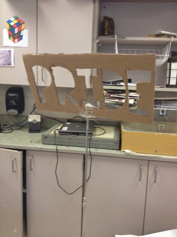
The Team: Madyson, Michelle, Rocio, Marissa, Brittany, and Ryn

The Idea: Our idea is to write PRIDE in the courtyard with chalk in black and yellow, school colors. At first we came up with a bunch of other words and phrases, like Come Together and Enchilada, but we decided on Pride since it would go with the school and was much shorter. We ran into some problems when the janitor wouldn't let us use the chalk under the overhang and on the ground, so we had to regroup and change the materials that we're going to use. Now instead of chalk we're going to do it in colored duct tape to match the school colors.

Thursday, April 10, 2014

Brushes


During this project we had do each download a brush of our choice from Brusheez. I choose this swirly type brush that looked really cool. After we downloaded it into Photoshop we got to play around with it and all the different setting like we have been working with. 

Butterfly Brushes

For the next tutorial we got to make our own brushes. First we had to find a picture to use, I decided to use a butterfly. Next we had to change the picture to a brush by going under edit and choosing define brush preset. Then we got to play around with the different setting that go along with the brushes.